
 |
| Fanart of the underrated Cybersix |
A lot of people, when they think of
comics from the 80s, they think of Miller's Dark Knight, Watchmen,
Claremont's X-Men, Crisis on Infinite Earth, or even the Secret Wars.
(Though no one should really think of the second one.) Basically big
epic comics that often spanned time and space, and truly gave birth
to the notion of the 'comic book event'. But not me. When I think of
comics in the 80's, I tend to think of things a little more black and
white. I think I've mentioned before that I got a lot of my first
exposure to independent comic books at the cusp of the Black and
White comic book boom of the 1980s. And as a result, the way I often
look at comics is at the lineart itself, and less at overall picture.
Coloring techniques have come a long ways since the bright tacky
colors and lens flares of the 90s. But before that, IF your comic was
lucky, you might get a colorist that can add in things like an extra
shade. Essentially, if you wanted shading done in your book, it was
going to have to be done in the lineart stage. Stark shadows, line
thickness, shading, textures... It was done all in pen and ink. It
had to be. Today, the digital stage of the comic page production can
do all that with a few clicks of a button. Now understand, I am NOT
taking away or belittling anyone who digitally inks. I admire them
and I'd be lying if I said there was no digital touching up done to
my own lineart. There's things that can be done with digital inking
that just cannot be done quickly, cleanly, or efficiently in hand
drawn ink.
 |
| Early Shadowgirls concept cover |
Simple point I'm trying to get to is
that I've always had a love to do black and white art, even though
people's never seen a lot of it. Back in the early days of my
artwork, I honestly never really imagined that I'd have a comic (much
less several comics) produced in color, so I kinda always settled on
the notion that I'd be a black and white artist. A lot of people's
love for B&W comics came about from the days of the Manga and
Anime book of the early 00s, and some people from the indie comics of
the earlier eras, such as myself. There was a time that I actually
was going in a totally different direction than the art most of you
have come to know me for today, and some of the art you're seeing to
the sides there. There was a bit of life and love that you can see in
an artist's lines. Even if there's a lack of talent, you can always
see the effort and the... Well, not to get esoteric with this... But
basically, you can see the artist's soul in their work.
When I started Shadowgirls, I never
planned to be the colorist. I was just happy being the lineart guy.
But the colorist we had didn't work out. (I believe the World of
Warcraft was involved.) So that's when I realized I had to be the
colorist too. It wasn't until Shadowgirls got to about Issue #4 that
I started to become comfortable with the process. I had spent a few
years trying to incorporate animation tricks and techniques into
production, to speed it up. Cutting time consuming line work, and
replacing it faster and sometimes more efficient coloring. And I had
done this for almost three years straight. As a result, I'm extremely
confident in my coloring skills and for the most part, it made the artwork look nice. But I bring this up, because way
earlier this year I had an epiphany about my own lineart, the heart and soul of the work.
I hated it.
It became manufacturing, as opposed to creating
art. I'm the last person in the world to get all arty-farty on you
folks. I mean it. But this was really driven home to me in this
picture I drew about this time last year, of the fake DC cover, “Red
X and the Outlaws”.

You look at the earlier lineart and you
look at THAT lineart and you tell me that there wasn't a
SEVERE loss of effort and quality. Oh sure, the lines may be more
confident and refined, but... Christ... I was doing 80% of the actual
work in the coloring stages. There are entire pages in the last bunch
of issues of Shadowgirls that didn't even have backgrounds drawn,
that I went in and digitally inserted them, because it was faster.
Yes, I know the coloring is nice, but it's not the same. It doesn't
have that finished feel. It felt compensated to me, like I was trying
to cover up mistakes. And I believe I was. And ALL my artwork was looking like this. (This is not an exaggeration. I picked this one, because it really showed the point well I thought.) But through all that, I became a better colorist,
because as the old saying goes in comics: Good coloring can make
substandard lineart look good. Remember that sentence, it's
coming back up in a few paragraphs. In short, I knew at after
realizing the above that I was not going to be ready to do another
comic book, until I got myself back up to a level of quality I
expected and demanded of myself.
So what happened next? Well, I sort of
fell off the face of the Earth for a bit, as far as art wise goes.
Doing small bits of fanart here and coloring gigs and assists there.
But the truth was, I wasn't happy with my artwork. I needed to
rediscover that right balance of quality I've always wanted. I know
many people assumed that I just threw my arms up and left the whole
thing completely, and that me talking about making a new was
basically empty talk. And for a while there, I almost believed it
too. I spent most of the year, sketching, drawing, and just trying to
rediscover that spark that drove me to want to make comic art in the
first place. I threw myself into a bunch of older comics I used to
read from the old days, and even dug into some newer ones, like Terry
Moore's Echo and Jeff Smith's recently concluded RASL. (I'm currently
waiting on the final collected book for that.) I wanted to see how
others do it in the old black and white. Seeing Moore's passion for
wonderful and dramatic characters, and Smith's stark black and white
mastery of storytelling. With the help of a few friends and some
actual real soul searching... Earlier this June, I sat down with a
picture, just to produce the best line art I could.
This was the result.

An amalgam of everything I had learned
over the years, with the clean lines and the more focused textures
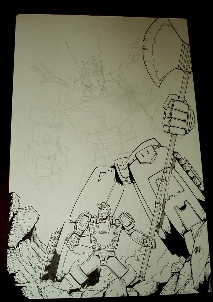
and the less sporadic crosshatching. I picked Transformers because
they're generally more complex than your average people drawing like
Batman or the Thing. Apparently, my time spent drawing and inking
tightly resulted in some people thinking I digitally inked this. (I
didn't as you can see HERE. Though I did touch up the clouds.) After
that, I did another one of the old Argentinean comic, Cybersix, which
you can see in the intro image up there. And then I did a couple
more. And that's when I realized that I was almost really to dive
back into comics again. But I needed to one more test... When I
mentioned that good coloring can save a bad lineart? Well, what would my coloring skills put to this new art look like?

I think I'm ready. It's feeling like the right blend again. (Better than before actually.) It's not perfect again, but I'm loving the artwork I'm making and that spark that had been missing for a long time now is back. And for those curious what the Black Banshee promotional picture from last time looked like without color...

More soon on Black Banshee soon. There'll probably be
another project underway too, a small B&W one as well, unrelated
to the Banshee, other than it's in the same universe. But that's too early to talk about right yet.
3 comments:
Excellent pic of Cybersix!
If you're interested I'm currently translating the old Cybersix comic on ym blog.
I actually already knew that. I've been reading them. It's how I got my references for drawing it. :)
Really!? Awesome!
Post a Comment